
- Why your brain secretly freaks out or chills based on website colors
- The science behind color-based snap judgments and their impact on conversions
- Which colors create urgency, calm, or excitement—and where to use them.
- Mini case studies showing how brands like Dunkin’, Coca-Cola, and Spotify use color strategically
- How to pick a palette that fits your brand personality and drives action
Ever landed on a website and just… felt calm? Or maybe your eyes zoomed to that red SALE sign like a magnet? That is no accident — that’s color psychology in marketing working its magic.
Almost 85% of consumers say color is the main reason they buy a product. And 93% admit that visual appearance plays a big role in their choices. Translation? Before anyone reads your carefully crafted words, their brain is already judging your colors.
Colors don’t just “look nice.” They decide whether someone trusts you, clicks your button, or bounces in 3 seconds.
Color Psychology in 10 Seconds: Your Brain’s Instant Reaction
Research shows up to 90% of snap judgments about products are based on color alone. Another study, Exciting Red and Competent Blue, found that color directly affects purchase intent because of how it shapes brand perception.
That whole “color boosts brand recognition by 80%” stat? It’s often misquoted. The truth: color enhances how we process information, compared to plain black and white. Still powerful, but let’s keep it accurate.
And then there’s the data on conversions. Brands have tested color tweaks that changed everything:
- Red CTAs → Amazon saw 23% higher conversions, Netflix got 19% more signups.
- Orange CTAs → Shopify reported 15% more trials, HubSpot saw a 21% boost in forms.
- Green CTAs → Spotify got 13% more premium conversions, Hulu improved retention by 11%.
One button color can literally shift your bottom line.
The Emotion Palette: Color Psychology in Marketing Explained
Let’s break down the color personalities:
| Color | Emotion | Where It’s Used / Why |
|---|---|---|
| Red | Urgency, Passion, Energy | Perfect for clearance sales, food delivery, or bold brands that want fast action. |
| Blue | Trust, Peace, Stability | Loved by banks, tech, and health brands — it calms the brain and builds loyalty. |
| Yellow | Optimism, Alertness, Cheer | Grabs attention and adds positivity — but too much can overwhelm. |
| Green | Balance, Health, Growth | Common in wellness, eco brands, and productivity tools — feels natural and calming. |
| Orange | Playful, Energetic, Friendly | Great for calls-to-action, youth brands, or sites that want to feel fun and open. |
| Purple | Luxury, Creativity, Mystery | Used in beauty, education, and creative industries — elegant with a touch of magic. |
| Black/White/Grey | Clean, Modern, Bold | Go-to for minimalist or luxury brands — classic never goes out of style. |
Mini Case Study: Why Dunkin’ Doesn’t Use Boring Colors
Ever wonder why Dunkin’ Donuts went with bright pink and orange instead of classic coffee browns?
It’s because their brand screams energy + playfulness, not just caffeine. Orange sparks appetite and action, while pink feels bold and youthful. Together, they stand out in a sea of coffee brands.
💡 Result? Dunkin’ isn’t just a place to grab a donut — it feels fun, even before you order.
Warm vs Cool Colors: Set the Mood of Your Website
- Warm (reds, oranges, yellows) → Urgency, energy, quick action. Perfect for sales pages, limited-time offers, and bold CTAs.
- Cool (blues, greens, purples) → Calm, stability, trust. Best for finance, wellness, tech—places where you want users to relax and stick around.
💡 Tip: Try a warm button (like orange or red) on a cool site to balance action + trust. It works wonders.
Designing With Empathy (and Accessibility)
Color has power, but with power comes responsibility. Around 300 million people worldwide are colorblind. If your design relies only on color to show meaning (“error = red”), you’re leaving people behind.
Use contrast checkers (like WebAIM), pair colors with text/icons, and design with empathy.
Being accessible isn’t just kind — it’s also smart SEO and boosts your UX score.
Build Your Brand’s Color Story
Still staring at that color wheel? Use this framework:
- Think of your core brand emotion: Calm? Exciting? Empowering?
- Match it to psychology → E.g., calm = blue, luxe = purple, playful = orange.
- Test it → A/B test buttons, banners, and palettes.
- Ask your audience → Customers often describe brands with color words (like “I love the fresh green vibes!”). Listen.
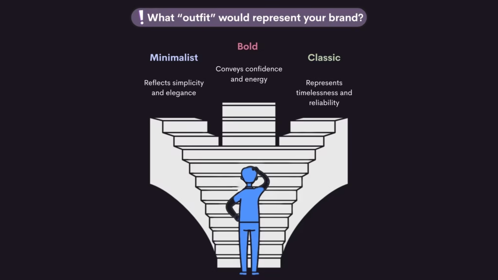
Colors = personality. You’re not picking “just a palette”—you’re dressing your brand.
Want to learn more about psychology related to design? You’ll also love our post:
Digital Psychology: 7 Ways It Shapes How You Think, Click, and Interact Online
💬 Final Thoughts
Your website’s color palette isn’t just a vibe — it’s a color psychology in marketing strategy. Want your brand to feel like a story, not just a site? Start with color.
Tell us your favorite brand-color combo in the comments!
And…
Imagine your brand as a dessert. What color is it? Why?
Is it calm like mint, or bold like red velvet?
Colors are feelings — pick the one that tastes like your brand.
Frequently Asked Questions
Color psychology in marketing is the study of how colors affect people’s impressions, emotions, and choices. Companies employ it to guide the vibe of their websites and products: bright yellows inspire hope, blazing reds promote urgency, and calm blues foster trust. It’s all about setting the correct feeling for the correct audience.
Color theory assists marketers put colors together in ways that get individuals interested and make them feel certain emotions. You can employ color theory to help you pick a strong call-to-action button or an appealing brand palette. It helps you balance colors for contrast, unity, and emotional effect. It makes pictures into strong ways to talk to people.
Different colors can make people feel and act in certain ways, according to color psychology theory. For instance, the color green is connected to health and growth, while the color black is connected to wealth and power. Cultural backgrounds have different reactions, but brands can use general patterns to get customers to feel something without declaring anything.
There’s no one-size-fits-all answer, but blue is often seen as the most powerful color in marketing psychology. It’s trusted, calming, and dependable — which is why banks, tech companies, and healthcare brands love it. But red is powerful too — bold, passionate, and impossible to ignore. The “most powerful” color depends on your brand goal.
Start by asking: What emotion do I want people to feel? Then pick colors that match that mood. For trust, use blues. For excitement, try reds or oranges. For wellness, greens and soft neutrals work well. Use consistent color choices across your branding — from logos to website to packaging — to build a strong emotional identity.
2 Responses