
We trust aesthetic layouts more than messy ones — thanks to the aesthetic bias, our brain links beauty with credibility, even before reading. Fonts, white space, and color schemes affect what we believe — your feed’s design silently shapes your trust, clicks, and saves. Creators use layout psychology to build trust (or sometimes mislead) — the same tools that calm your brain can also be used to manipulate it.
Have you ever saved an aesthetic Instagram post without reading the caption? Same. Whether it’s muted tones, serif fonts, or a perfect balance of white space — our brain often trusts beauty before logic. But why does that happen?
Enter the aesthetic bias — a cognitive shortcut where we assume that if something looks good, it must be good. In the world of digital psychology, this bias doesn’t just affect what we trust — it shapes how we scroll, click, and even buy.
This article explores the psychology behind visual trust, especially in social media design layouts. We’ll break down what makes content feel credible, how creators use this power for good, and how your brain is quietly influenced every time you scroll through your feed.
This is the same design psychology I use in my own content over on @neurinative — if you like bite-sized, aesthetic psych posts, you might love it there too.
Why Do Pretty Design Layouts Work?
The aesthetic bias is a psychological principle where people assume visually pleasing design = higher quality, intelligence, or reliability — even when the content is the same. It’s part of the broader halo effect, a bias where one positive trait (like attractiveness) influences how we perceive other traits (like intelligence or trustworthiness).
In digital spaces, this bias doesn’t just apply to people. It applies to design layouts, fonts, color schemes, and even how spacious a post looks.
🧠 Your brain is wired to process beautiful content more fluently. The easier it is to process, the more “true” it feels.
How the Aesthetic Bias Shows Up in Your Feed
Let’s be honest — you’ve probably scrolled past a thread with clashing colors and blurry text, even if the content was brilliant. Then you saved a beige carousel that basically said the same thing. This is design layouts at work, not logic.
Here’s how this bias sneaks into your scroll life:
| Visual Element | How It Influences You |
|---|---|
| Serif fonts | Feel refined and trustworthy |
| Neutral/pastel tones | Feel calming, thoughtful, non-threatening |
| White space | Feels intentional, spacious = “organized” |
| Consistent layouts | Makes content predictable = your brain feels safe |
You’re not shallow for liking pretty content. You’re human. And your brain is doing exactly what it evolved to do.
Real-Life Example: Why Instagram’s “Clean” Aesthetic Wins
Have you noticed how some carousels feel more real even if they’re saying obvious things? That’s not a coincidence — it’s layout psychology in action.
Creators design posts with hierarchy, contrast, and emotional safety in mind. Even fonts and spacing can communicate calm authority. A 2023 report on visual design and user trust showed that users rate aesthetically pleasing content as 27% more credible, even with no author or source listed.
Why Pretty Design Layouts Works (Even When It Shouldn’t)
Here’s the wild part: design layouts can fool us into thinking content is smarter or safer — even when it’s not.
That’s why misinformation can go viral if it’s wrapped in soft neutrals and calming vibes. Design hijacks your cognitive load, making you feel like you’ve learned something deeply… even if it was oversimplified or totally wrong.
This doesn’t mean design is bad — it means we have to use it ethically and consciously.
How Creators Can Use Design Layouts for Good
If you’re sharing meaningful content, here’s how you can make your posts aesthetically pleasing and trustworthy:
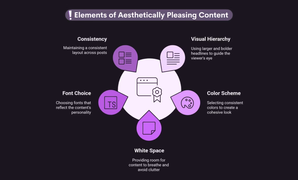
✅ 1. Use Visual Hierarchy
Make headlines larger and bolder, so your viewer’s eye naturally flows.
✅ 2. Stick to a Color Scheme
Pick 2-3 soft or brand-aligned colors that you repeat throughout. (Consistency = safety!)
✅ 3. Use White Space
Don’t cram info. Spacing gives your content room to breathe — and your audience, too.
✅ 4. Choose Fonts with Personality
Round sans-serifs = friendly
Serifs = smart/credible
Display fonts = fun (but use sparingly)
✅ 5. Stay Consistent Across Posts
Your layout becomes a visual identity. The more familiar it is, the more people trust it.
Curious how design trends like the Clean Girl Aesthetic play into this? Read the breakdown here.
The Brainy Takeaway
Design layouts aren’t just about looking good — they’re about feeling good.
They create a bridge between what your brain wants (clarity, calm, simplicity) and what you’re trying to say.
That trust, that click, that save?
It didn’t just happen. The layout did the work.
Frequently Asked Questions
Because it builds instant trust, grabs attention, and makes information easier to process. A good-looking design = a trustworthy message (to your brain).
Your brain prefers things that are easy and enjoyable to look at. When something feels nice visually, we naturally think it’s better, safer, or smarter.
Aesthetics make us feel good, reduce cognitive load, and help us connect emotionally. We’re wired to trust beauty — it’s a survival shortcut.
Balance, clarity, contrast, white space, color harmony, font consistency, and intentional layout. It’s about guiding the eyes and calming the brain.
Visual hierarchy, unity, contrast, rhythm, proportion, and simplicity. These elements help content feel trustworthy, polished, and emotionally appealing.