
Ever looked at a website and just felt like it was clean, easy, and a total joy to scroll through? That’s no accident — it’s white space working its magic ✨.
In this article, we’ll break down how white space in web design, paired with clever layouts and a sprinkle of UX psychology, can turn your site from meh to perfect. Plus, we’ll spill the tea on the types of website layouts and UX design techniques that make it all click.
What Even Is White Space?
White space in web design (aka negative space) is the space between elements — text, images, buttons, and even page sections. It’s not just “empty.” It’s a breathing room for your content.
Think of it like silence in a conversation — sometimes, it says more than words. In design, white space enhances readability, clarity, and emotional comfort.
Why White Space in Web Design Is a UX Superpower
White space does so much more than just make a site “look clean.”
Here’s why users (and their brains) love it:
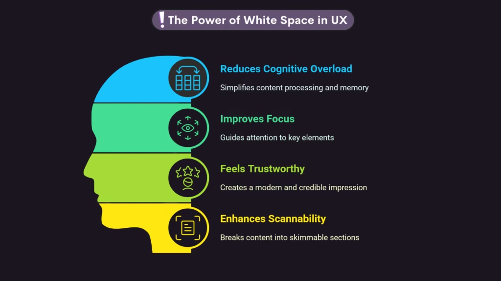
- Reduces cognitive overload: Cluttered pages overwhelm users. White space makes content easier to process and remember.
- Improves focus: It guides attention to key areas — like a product image or a CTA button.
- Feels trustworthy: Spacious design feels modern, polished, and credible. Visitors are more likely to stick around and convert.
- Enhances scannability: Most users don’t read — they scan. White space breaks up the page into bite-sized, skimmable sections.
This all ties back to the psychology of UX: people feel more relaxed and in control when they can navigate a site easily and intuitively.
Types of Website Layouts That Pair Perfectly with White Space
Let’s get into some types of website layouts that play really well with white space:
1. F-Layout
Users scan pages in an F pattern — top horizontal, another horizontal beneath it, then vertical down the left. White space makes those sections pop, especially your hook, subheading, and CTA.
2. Grid Layout
Grids keep everything aligned and aesthetic. Add generous gutters (the spaces between columns) and margins to create a calm and balanced vibe.
3. Single-Column Layout
A single column keeps users focused and scrolling. When paired with white space, it feels sleek and user-friendly.
4. Asymmetrical Layout
Asymmetry = creative edge. And white space is what keeps it from turning into chaos. Balance the layout with strategic blank areas so your design still breathes.
5. Z-Layout
Similar to F, the Z layout follows how eyes move across the screen. Use white space in the diagonals to guide users naturally from top-left to bottom-right.
The Psychology of UX: Why Space = Emotion
Let’s zoom in on the psychology of UX and how white space connects emotionally with users.
- Too much info = stress. Clean layouts reduce decision fatigue.
- Visual rhythm = comfort. Predictable spacing, consistent design systems, and clear hierarchies calm the brain.
- Clarity = confidence. When a site looks clear and purposeful, users feel confident engaging with it.
White space doesn’t just make things look pretty. It makes them feel right — and in design, feelings matter more than facts sometimes.
UX Design Techniques That Enhance White Space in Web Design
If you want to unlock the full potential of white space, you need the right UX design techniques:
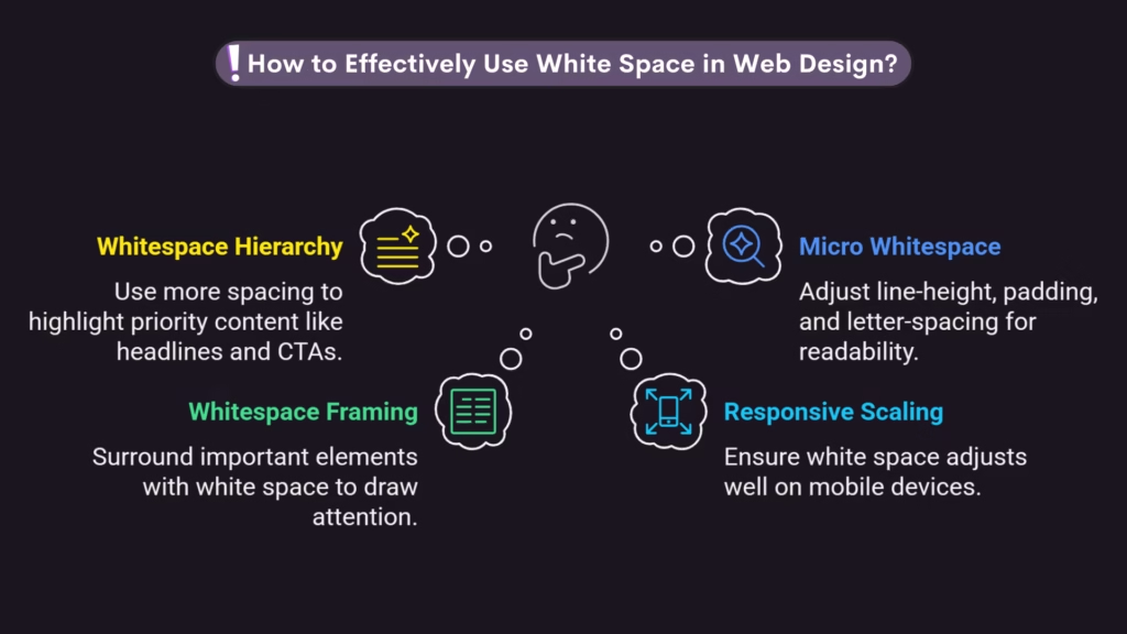
- Whitespace hierarchy: Use more spacing to highlight priority content. Your headline and CTA? Give them room to shine.
- Micro whitespace: Line-height, padding, letter-spacing — those tiny details drastically change how readable your site feels.
- Whitespace framing: Surround important elements (like pricing tables or forms) with white space to draw the eye.
- Responsive scaling: Always check how white space adjusts on mobile. You don’t want elements crammed on small screens!
These techniques help you use space intentionally instead of accidentally.
Bonus: Why Minimalism = Smart Design
Minimalism isn’t about removing things — it’s about revealing what matters. In a digital world overflowing with ads, pop-ups, and distractions, white space becomes a silent hero.
It makes your message stronger by doing less but meaning more.
And when paired with a clean layout, it boosts trust, readability, and even SEO metrics like time-on-page and bounce rate. Yup — space is a ranking factor too.
If you found this helpful, you’ll love our article:
Scroll. Scroll. Scroll. Why You’re Stuck – And How UX Took Over
It dives even deeper into the psychology that fuels online decisions and scrolling behavior!
Final Thoughts: Breathe Life into Your Design
White space isn’t just an aesthetic choice. It’s a strategic decision rooted in UX psychology, emotion, and clarity.
So the next time you’re laying out a webpage, ask yourself:
Does this breathe?
Does it guide?
Does it feel human?
Because a well-designed space isn’t just seen — it’s felt.
Frequently Asked Questions
In web design, white space is the empty space between the words on a website and the edge of the screen. It makes the text look clean and simple to read.
White space is good for web design! It helps people learn, concentrate, and have a better experience generally. When used right, it gives websites a more fresh and reliable look.
A white space area is any part of a web page that doesn’t have anything on it, like the empty space between text, pictures, or sections. It lets the plan stay balanced and gives you room to breathe.
In UX design, white space helps users focus on what’s important by preventing brain overload and improving visual flow. It makes things look and feel simpler and easier to use.
White space on the web comes in two main types: macro white space, which is the big space between big parts, and micro white space, which is the small space between lines or buttons.